
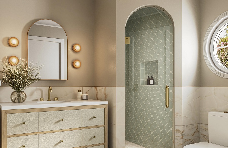

Walk into a thoughtfully designed boutique hotel bathroom, and you will often find a rich, layered combination of surfaces: a bold geometric pattern underfoot, a tactile subway tile wrapping the shower walls, and a delicate mosaic tucked into a recessed niche. It looks collected, architectural, and effortless. Try to replicate that same energy in a residential remodel without a structured framework, however, and the result can easily resemble a chaotic tile showroom clearance sale.
Mixing three distinct tiles in a single bathroom is one of the most rewarding design challenges in residential interior design. Done right, three tiles establish depth, delineate wet zones from dry zones, and give an ordinary bathroom custom character. Done wrong, the room suffers from sensory overload, where competing grout lines, conflicting undertones, and mismatched proportions fight for dominance.
Achieving balance among three separate tile choices comes down to mastering scale, establishing a clear visual hierarchy, maintaining strict palette discipline, and treating grout as a primary design element rather than an afterthought.
The Rule of Three: Assigning Structural Roles
The quickest way to invite visual chaos into a bathroom is to select three tiles that all demand to be the center of attention. When a dramatic heavily veined marble slab, an intricate encaustic cement pattern, and a bold geometric starburst are forced into the same small footprint, the human eye has nowhere to rest.
A successful three-tile scheme functions like a well-cast production: you need one clear protagonist, a dependable supporting actor, and a subtle character actor that adds nuance.
The Anchor Tile (roughly 60 percent): This is your foundational surface, covering the largest continuous square footage—typically the main bathroom floor or the extensive walls of the shower enclosure. It should be visually grounded, versatile, and relatively calm. Large-format porcelain slabs, neutral honed limestone, or classic white field tiles excel in this role because they provide a stable background plane.
The Secondary Tile (roughly 30 percent): This selection complements the anchor while introducing a distinct shift in texture or orientation. If your anchor tile is a large-format matte porcelain on the floor, your secondary tile might be a classic glazed subway tile or vertically stacked zellige lining the shower walls or wrapping the vanity backsplash. It supports the primary material without duplicating it.
The Accent Tile (roughly 10 percent): This is the punctuation mark of the room. Reserved for compact, intentional focal points—such as the floor of the shower pan, a decorative border, or the interior back wall of a shampoo niche—the accent tile can afford to be graphic, deeply textured, or rich in color. Because its footprint is physically restricted, it delivers personality without overwhelming the room.
Mastering the Scale Differential
Visual clutter in bathroom tile rarely stems from color alone; it is almost always triggered by competing pattern scales. When you pair two or three tiles of roughly the same physical size—such as an eight-inch square patterned ceramic, an eight-inch hexagon, and a six-by-six square field tile—the eye attempts to reconcile grids that were never designed to align. The result is a vibrating, unsettled look.
To create immediate visual harmony, vary the physical scale across all three selections by choosing one large, one medium, and one small format:
- Large-Scale: Formats measuring 12×24 inches, 24×48 inches, or full continuous slabs. Large tiles drastically reduce the number of grout lines, creating expansive, unbroken planes that settle the eye and make compact rooms feel larger.
- Medium-Scale: Standard subway tiles (such as 2×8 or 3×12 inches), square four-by-four ceramics, or picket tiles. These introduce gentle rhythm, shadow, and directional movement across vertical wall surfaces.
- Small-Scale: Hexagonal mosaics, penny rounds, basketweaves, or kit-kat finger tiles. These provide fine-grained textural detail and essential wet-area slip resistance underfoot.
By stepping through small, medium, and large proportions, each tile operates on its own visual frequency. The large tiles quiet the room, the medium tiles frame the architecture, and the small mosaics draw the eye inward for tactile appreciation.
Establishing a Common Chromatic Thread
Three different shapes and three different sizes can live together in complete serenity if they are bound by a cohesive color palette. The foundational rule of mixing multiple materials is straightforward: the more variance you introduce in shape and scale, the more disciplined your color palette must be.
If you want to experiment with dynamic geometric layouts—such as a herringbone floor, a vertically stacked shower wall, and a penny-round niche—keep the entire room within a monochromatic or closely adjacent tonal family. A palette composed of warm whites, pale greiges, and soft biscuit tones allows diverse shapes to shine without shouting over one another.
If you prefer high-contrast drama, pull your colors directly from the most complex material in the room:
- If your accent tile is a Calacatta marble with charcoal and soft honey veining, let those veins dictate your other choices: an off-white field tile on the shower walls and a charcoal slate on the floor.
- Pay meticulous attention to color undertones. A common pitfall is pairing a cool, blue-based bright white ceramic with a warm, creamy travertine. Under artificial bathroom illumination, the cool white will make the natural stone look dirty, while the warm stone will make the white ceramic look clinical and stark. Ensure all your neutral backgrounds share either warm or cool roots.
Balancing Sheen and Tactile Depth
How a surface reflects light determines how spacious and inviting a bathroom feels. A room surfaced entirely in high-gloss glazed tile can feel slick, blindingly reflective, and cold. Conversely, an all-matte bathroom devoid of reflection can look heavy and absorb light, making compact windowless spaces feel cave-like.
Blending matte and gloss finishes brings three-dimensional life to the design:
- Anchor the floor with matte finishes: For safety and visual grounding, floor tiles should almost always carry a honed, matte, or textured surface. Matte porcelain or honed stone absorbs light and provides crucial slip resistance when wet.
- Elevate walls with glossy or satin glazes: Vertical walls are the ideal canvas for glazed ceramics, hand-molded zellige, or glass. Glossy finishes catch overhead lighting and daylight, bouncing illumination back into darker corners and creating subtle, rippling shadows across imperfect surfaces.
- Rely on texture for monochromatic palettes: If you choose an all-white or all-neutral bathroom, let texture serve as your third variable. Combine a smooth, large-format porcelain floor with a fluted vertical wall tile and an organic, tumbled-pebble shower floor. The color remains tranquil, but the tactile variety keeps the space from feeling sterile.
Grout Discipline: Controlling the Grid
Grout is effectively an invisible fourth material. Every grout line is a permanent line drawn across the room. If you select high-contrast dark grout against three different white or light tiles, you are not simply installing three tiles; you are stamping three competing graphic grids onto your room.
To keep a three-tile bathroom cohesive, use grout to control which surfaces stand out and which recede:
- Match grout to tile on intricate layouts: On small-scale mosaics or complex patterns like herringbone, specify a grout color that closely matches the tile body. This softens the joint lines, allowing the overall texture and shape to read as a continuous surface rather than hundreds of tiny bordered boxes.
- Reserve contrast for a single surface: If you want contrasting grout—such as medium gray grout against white subway tile to highlight a traditional bond pattern—keep the grout on your other two tiles strictly tone-on-tone. Allowing two contrasting grids to collide in an inside corner creates jarring visual friction.
- Specify narrow joint widths: Opting for rectified-edge tiles on your large-format selections allows for ultra-narrow joints (one-sixteenth of an inch), minimizing visual interruptions and letting the materials speak for themselves.
Establishing Clean Transitions and Boundaries
Even a perfectly balanced trio of tiles will look disorganized if the materials terminate awkwardly in the middle of a wall. Physical transitions between tiles must feel structurally deliberate and architectural.
Avoid ending a tile run midway across an open sheet of drywall without an architectural justification. Instead, align material transitions with structural boundaries: let wall tile terminate at the inside corner of a room, directly beneath a soffit, or flush with the outer casing of a window frame.
Treat functional features like recessed niches as contained display boxes. Line the jambs and sill of the niche with the same quiet stone or solid quartz slab used on your vanity counter, and confine your decorative accent tile strictly to the rear wall. This frames the accent material cleanly, eliminates clumsy exposed tile edges, and ensures your three tiles work together as a polished, harmonious whole.